Case study · product
Bythen Chip Raffle
A limited-supply NFT drop where the rules changed every phase. I designed the access system that kept buyers oriented through minting, bidding, claiming, and refunds.
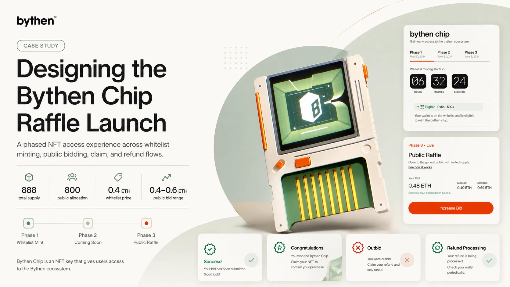
Bythen Chip is an NFT key into the Bythen ecosystem, used for ongoing access rather than held as a collectible. Supply was capped at 888. 800 went to the public across three phases; 88 stayed back for investors, team, and reserve. The drop ran on three different sets of rules, and a buyer could lose money guessing which one applied to them. I designed the access system that kept those rules legible at every step.
My role
Inside a launch team, I owned the flow design and interface states across all three phases: whitelist minting, public bidding, and the post-result claim and refund paths. The two decisions I want to be judged on are the state coverage and the way the bidding model was explained. Both are below.
The problem
This was an access system rather than a mint page. The rules changed every phase: whitelist eligibility in Phases 1 and 2, open bidding in Phase 3. The buyer carried the risk of misreading them.
A buyer connects a real wallet and signs transactions that move ETH and can’t be undone. So the questions weren’t “can I buy this.” They were sharper:
- Am I eligible, and which phase am I in?
- Why can or can’t I mint right now?
- If I place a bid and lose, where does my money go?
- Is my claim or refund actually being processed, or did it stall?
A wrong answer to any of these costs money. Every state had to read true before a user clicked.
Approach: states, not screens
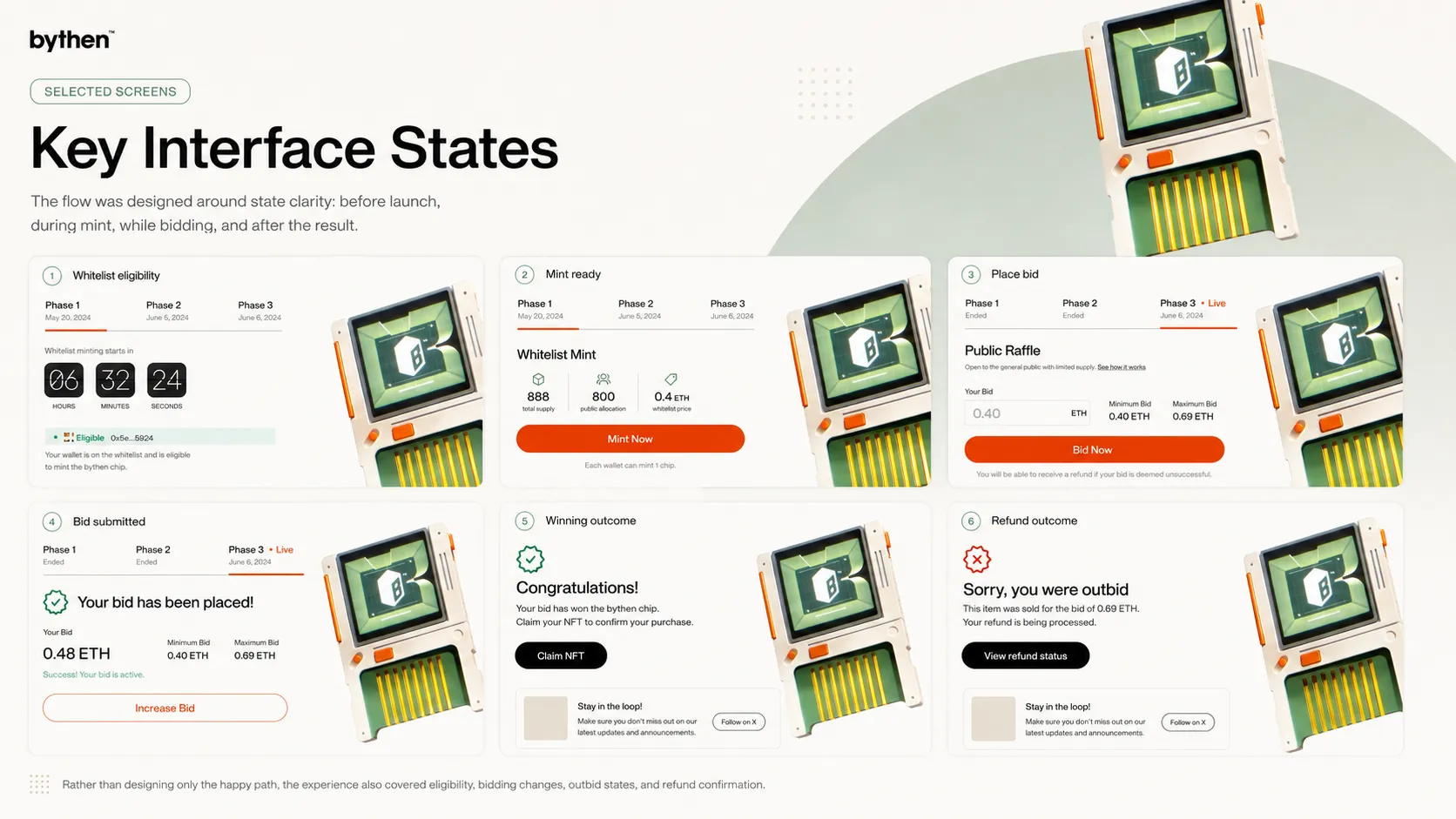
I designed the launch as a system of states rather than a single happy path. Drawing the screens was the straightforward part. The harder work was naming every moment a buyer could stall and giving each one a clear answer:
before a phase opens, after connecting a wallet, eligible, not eligible, mint live, already minted, sold out, bid below minimum, bid placed, increasing a bid, phase ended, won, lost, outbid, claiming an NFT, claiming a refund.
That list set the interface’s job: enable the action, and remove doubt at each step. Phase tabs sat across the top as the orientation layer, so three sets of rules read as one connected launch instead of three separate drops.
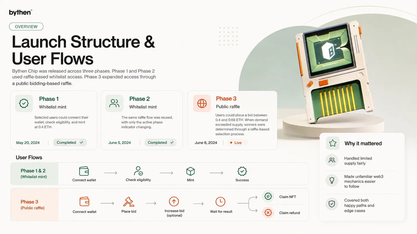
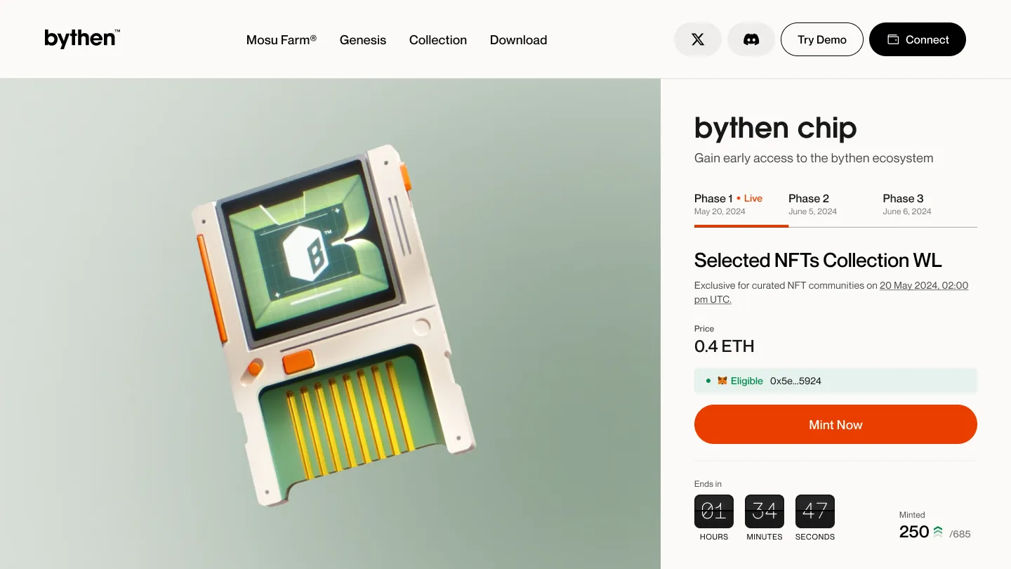
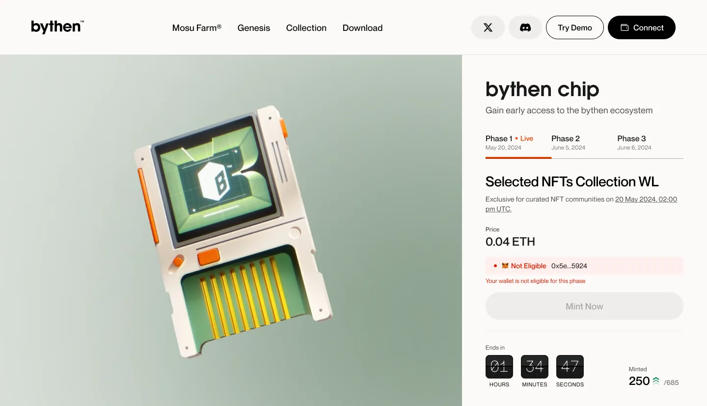
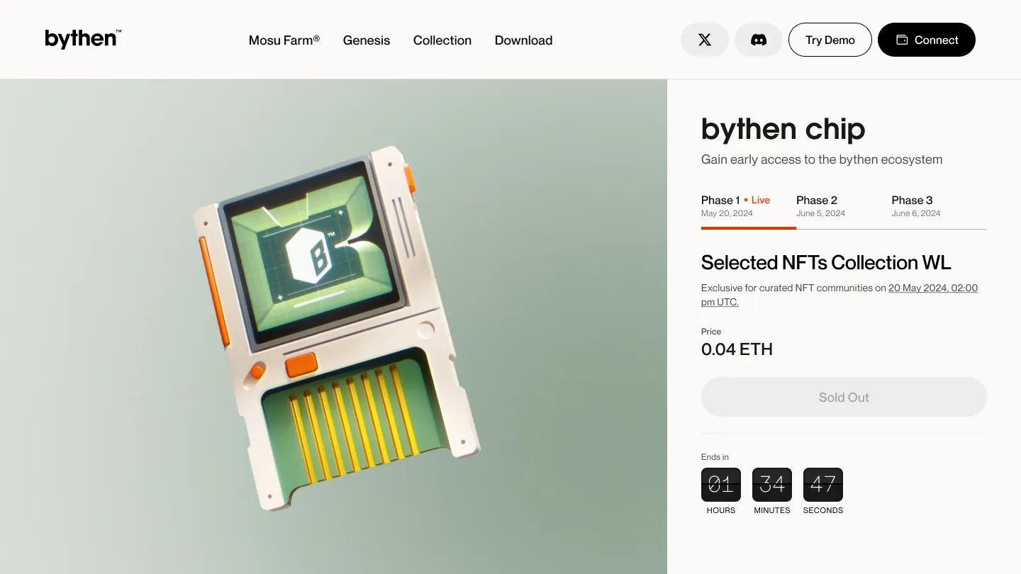
Phase 1 and 2: Whitelist mint
Both whitelist phases ran the same logic. Connect a wallet to check eligibility; if selected, mint one Chip at 0.4 ETH once the phase went live. The decision that mattered was showing eligibility before and during the mint window, so a user understood what they could do and why.
Phase 2 reused the Phase 1 pattern and changed only the active-phase indicator. The trade-off was consistency over novelty. The logic hadn’t changed, so making users relearn the flow would only add friction.
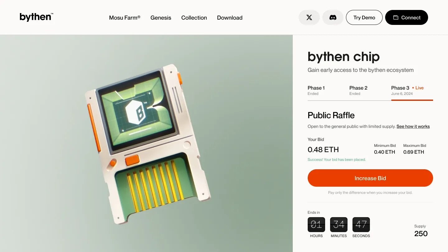
Phase 3: Public bidding raffle
Phase 3 opened to everyone and introduced a harder model. Users placed a bid inside a visible minimum-to-maximum range. If demand beat supply, a raffle decided the winners. This was neither a plain auction nor a plain raffle: bidding bought participation, and selection still decided the result.
I kept the bidding area focused on the action and pushed the mechanics into a “How the Public Raffle works” panel: current bid, min, max, countdown, supply, bid status, and what to expect if a bid lost. The input rejected bids below the minimum. Once a bid was placed, the screen switched from input to status, confirming the bid was in and could be raised.
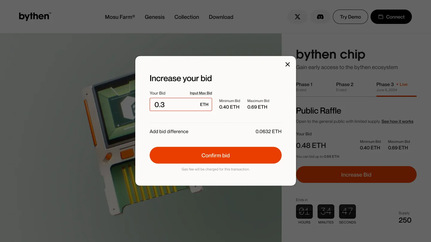
Raising a bid ran through a modal showing the difference, a deliberate confirmation before a second transaction.
The trade-off was a simple action against deep explanation. I would revisit it: the winner-selection logic and refund timing belong inline, not folded into a panel a user has to open.
Trust after the result
Most flows treat losing as a dead end. Here, a loser had money in the system and needed to know what happened to it. So the result states got the same care as the wins.
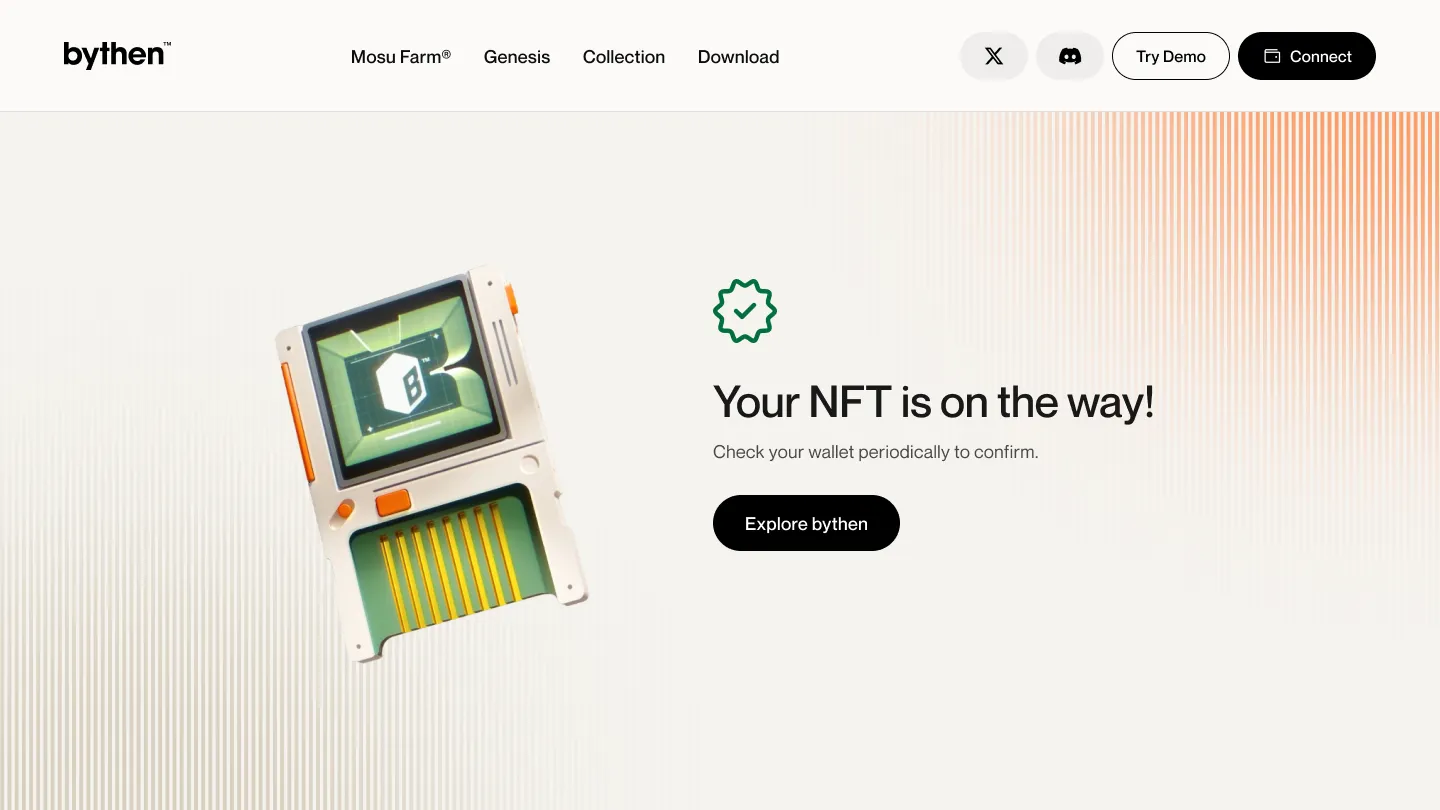
A winner got a clear next step: claim the NFT. After claiming, the screen confirmed the NFT was on the way and prompted the user to check the wallet. Blockchain transactions can feel invisible, so the UI had to confirm the action started even before the wallet caught up.
Losing split into two states on purpose. “Unlucky” meant the raffle didn’t select you. “Outbid” meant your bid wasn’t competitive. The two carry different mental models, so each got its own copy, and both routed to a refund.
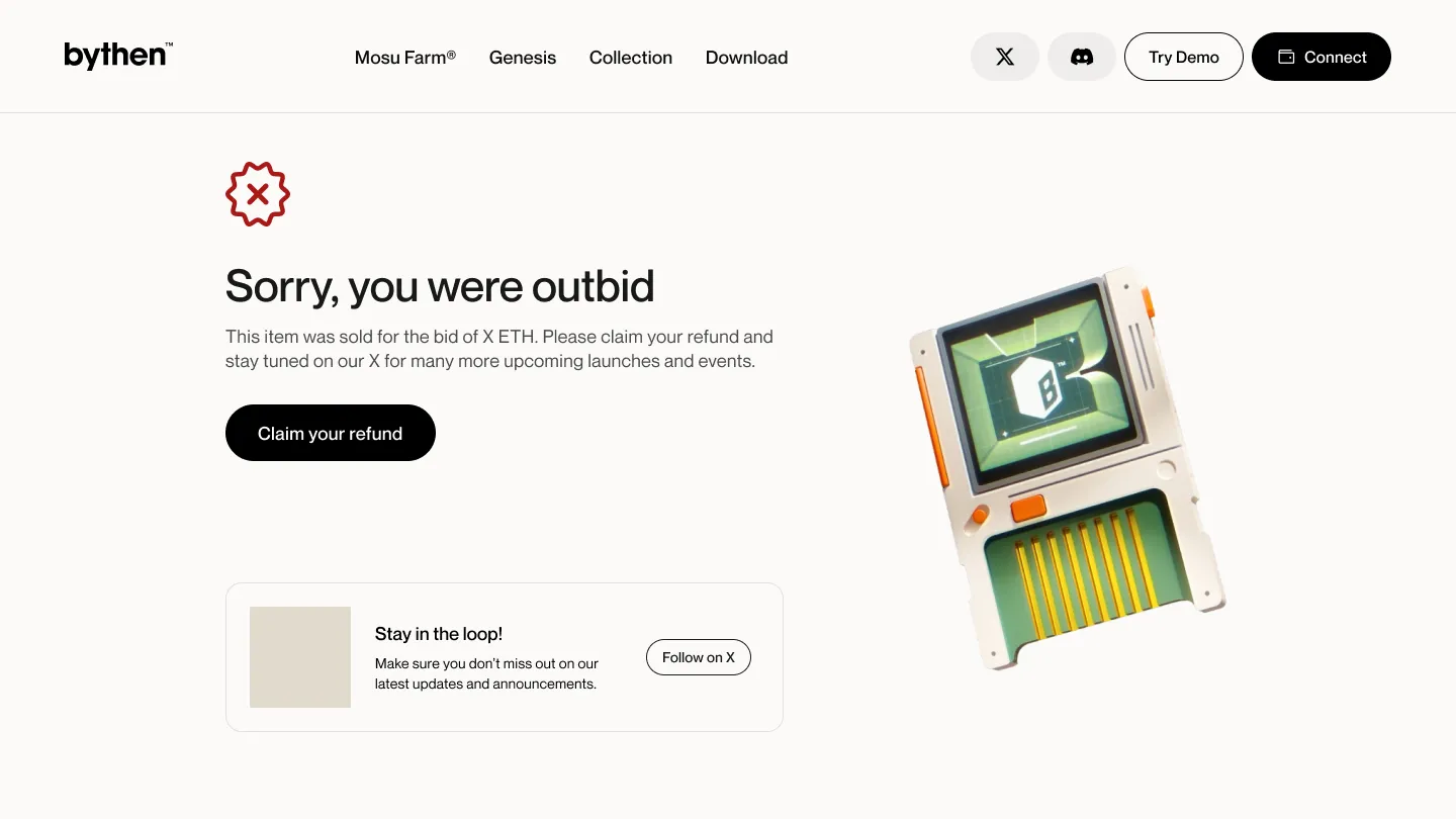
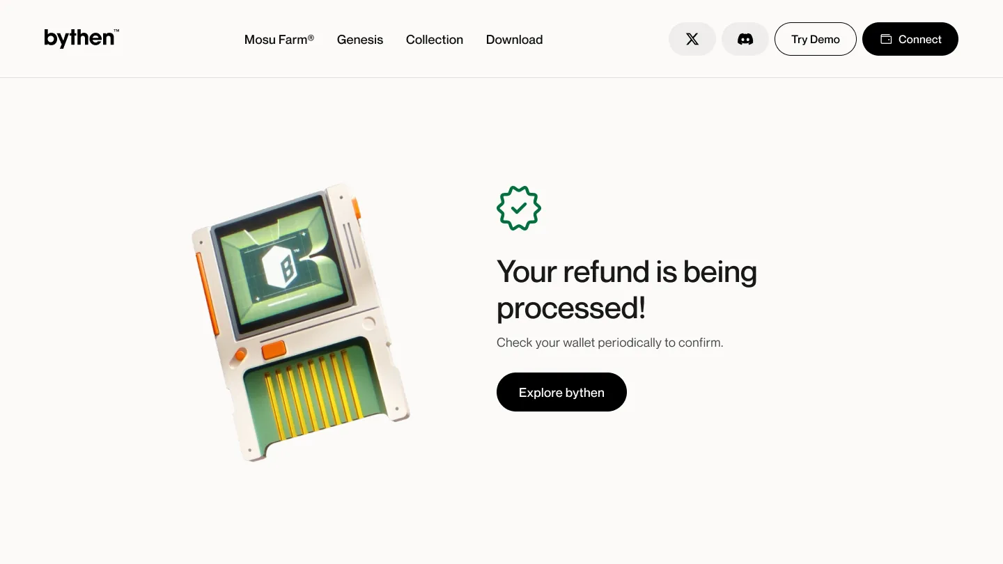
Treating claim and refund as first-class states, not error pages, was the call I stand behind most. In a money flow, the refund path is part of the product.
Outcome
The launch shipped and ran its full course across all three phases: whitelist mints, public bidding, and the claim and refund paths after results landed. Sales figures sit behind internal data I can’t publish, so I’ll leave the numbers out and point at the design instead.
What the system owned was the hard half: across sold-outs, ineligible wallets, lost bids, and refunds, a buyer always knew their state and their next action. The phase structure held the launch together as one timeline even as the rules changed underneath it.

What I’d improve
Make the Phase 3 model clear earlier. “Raffle,” “bid,” and “winning bid” set different expectations; some users read auction, others read lottery. I would state up front how bidding feeds selection and when refunds open.
Sharpen the transactional copy on claims and refunds: timing expectations, wallet-confirmation guidance, and what to do if a transaction runs long. I would also unify the post-action confirmations into one template. Claim, refund, and success already worked on their own, but they could read as one system.
What I took from it
In a complex flow, clarity is mostly about reducing uncertainty, not visual polish. The hard part of this launch was never making the drop look good. It was helping people understand access, timing, eligibility, ownership, and refunds while the rules shifted under them. Designing around states rather than screens is what made that legible.